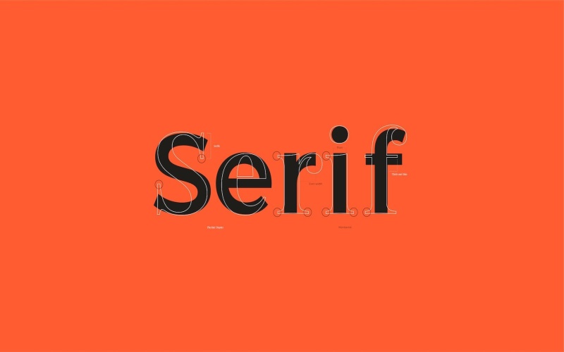
Among the various typographic styles, serif fonts are timeless and enduring. With their distinctive features and rich history, serif fonts are widely used in print and digital media, offering a sense of tradition, readability, and elegance. Keep reading to learn about serif fonts style.
The Anatomy of Serif Fonts
Before diving into the merits of serif fonts, it’s essential to understand their defining characteristics. Serifs are small, decorative strokes or lines that extend from the ends of the main strokes of letters. These subtle embellishments give serif fonts their unique appearance. Serif typefaces can be categorized into four primary subgroups:
Old Style Serifs
Old-style serifs have a more organic and calligraphic feel. They are characterized by their diagonal stress, moderate contrast between thick and thin strokes, and bracketed serifs. TT Bells is a fascinating typeface from the TypeType collection.
Transitional Serifs
Transitional serifs shift towards greater contrast between thick and thin strokes and more vertical stress than old-style serifs. Notable typefaces in this category include TT Marxiana.
Slab Serifs
Slab serifs, also called Egyptian or square serifs, are characterized by their thick, blocky serifs. They have a more modern and robust appearance, making them suitable for bold headlines and branding. Popular examples include TT Cometus from TypeType foundry.
Legibility and Readability
One of the primary advantages of serif fonts is their exceptional legibility and readability, especially in long-form text. The serifs help guide the reader’s eye along the text, making it easier to follow the flow of words. Studies have shown that serif fonts can enhance reading speed and comprehension, making them a preferred choice for books, newspapers, and academic publications.
Versatility
While serif fonts are often associated with formal and traditional applications, they are surprisingly versatile. Serif fonts can adapt to various design contexts depending on the specific typeface and styling choices. For instance, a modern and minimalistic serif font can add a touch of sophistication to a website or logo. In contrast, a more ornate serif can elevate the aesthetics of a vintage poster or wedding invitation.
The Digital Age and Serif Fonts
Screens and devices dominate our reading experience. The choice of fonts is more critical than ever. While sans-serif fonts have gained popularity due to their clean and straightforward appearance on screens, serif fonts continue to have a place in web and mobile design. Many contemporary websites and apps use serif fonts for headings and titles to create visual contrast and establish a strong brand identity.
Conclusion
Serif fonts are a testament to the enduring power of typography. With their rich history, legibility, timeless elegance, and adaptability, serif fonts remain a reliable choice for various design projects. Whether crafting a print publication, designing a website, or creating a logo, serif fonts offer a sense of tradition and sophistication that is hard to match. Their subtle serifs continue to guide readers through the written word, making them a valuable tool in the arsenal of any designer or communicator. In a world of ever-changing design trends, serif fonts stand as a steadfast reminder of the beauty and functionality of typography.

