A website is a core pillar for any eCommerce business. Our challenging and fast-paced world makes it a daunting task to keep up and evolve constantly. And here is an alarming reveal from Amazon Web Sciences – 88% of shoppers doubt they will revisit a website if they got a negative experience on it. So the question is, how to improve UX on a website with a visible result?
Basically, there is no shortage of aspects that have an impact on UX. That’s why it’s always advisable to test and do analytics if possible. But anyway, even if you don’t want to spend a lot of energy on redesigning your website, here are some basic tips that can make a difference and show your web page from the brightest side.
Optimize your website loading speed
Long waiting hours are always frustrating, especially when you also have to deal with them in a digital space. People expect websites to be fast loading and easily accessible from any device. If something doesn’t live up to their expectations, they bounce.
First, you need to get insights into your page speed. Consider using Google free tools or any others to get a proper overview and suggestions on how to improve the load speed. You can also run all your visuals through compressors to reduce the size and make them load quickly, even from a mobile.
Use pop-ups to collect feedback
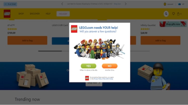
Nothing can be more valuable for a digital marketer than direct feedback from customers about any problems on a website. The question is, how to ask them efficiently? While email campaigns can yield some results, a highly resulting way would be asking your leads just on a website. You can run pop-ups for those, who have visited your web page more than once.
Have a look at how LEGO does it. The company displays a popping box inviting a user to take part in a questionnaire or to leave feedback. Together with a suitable visual and wording, such a pop-up not only helps the company to improve but shows that they value their buyers’ options in the first place.
Create a catchy 404 page
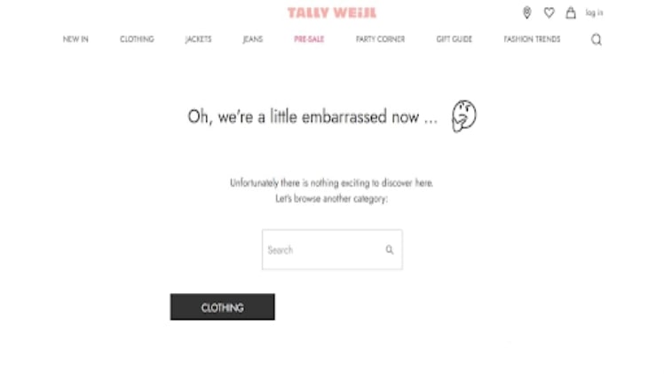
There’s nothing terrible with “Oops, something went wrong” as well as nothing memorable in the slogan. It may happen that you changed or moved some content without adjusting internal links. For any prospect, it’s not the best sort of experience, but even here you can make them stay on your website for a couple of seconds longer and appreciate a creative 404 message.
For example, Tally Weijl maintains its rather minimalistic design but displays an unusual text to indicate a problem. Being more creative in such cases can help you smooth over the danger of a negative UX.

Implement compelling CTAs
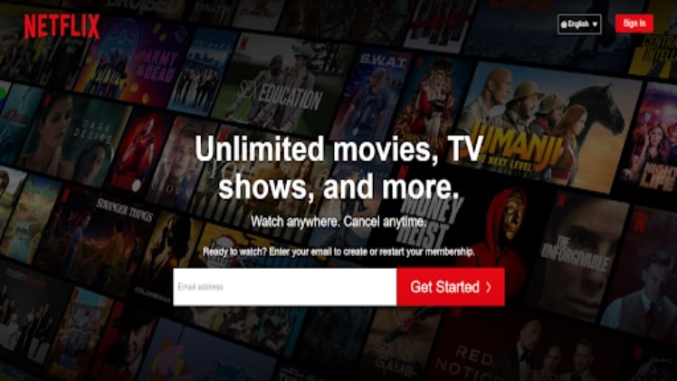
Call to action, or CTA for short, means a piece of content that is tailored to induce a customer into a specific act. Visible and attractive CTA buttons can enhance customer experience drastically. Interestingly, the color of your CTA can make a difference. In psychology, different colors evoke opposite emotions and feelings. Apparently, red-colored CTAs seem more attractive to website users, as Sitepoint revealed a 35% increase in conversions after they switched from a green button to a red one.
Here is one more example with red CTAs from Netflix. It’s also the color of their company logo, so red buttons look catchy and at the same time consistent with the brand image.

Provide live support
Availability of a live chat on a website significantly improves the quality of general customer support. While browsing a website, a user may encounter some problems or come up with questions that they would want to discuss with a manager. A button in a website corner with a live manager is a great way to help your visitors and therefore improve their experience from shopping.
Peloton, for example, provides a chatbot for its users, but redirects a conversation to a live chat agent, if a customer has less general questions.
An example of a live chat on a website. Source: Peloton
Wrapping up
To conclude, there can be numerous possibilities to enhance UX on a website. In this article, you found some basic but essential ways to improve it, without major changes of your web page. Keep testing and experimenting with your eCommerce website to find out what attracts your visitors the most!
Great compared to other streaming destinations, but incomprehensible to use tainiomania
Free download and stream movies and web-shows from Filmy4wap

